Um dir ein optimales Erlebnis zu bieten, verwenden wir Technologien wie Cookies, um Geräteinformationen zu speichern und/oder darauf zuzugreifen. Wenn du diesen Technologien zustimmst, können wir Daten wie das Surfverhalten oder eindeutige IDs auf dieser Website verarbeiten. Wenn du deine Einwilligung nicht erteilst oder zurückziehst, können bestimmte Merkmale und Funktionen beeinträchtigt werden.
Die technische Speicherung oder der Zugang ist unbedingt erforderlich für den rechtmäßigen Zweck, die Nutzung eines bestimmten Dienstes zu ermöglichen, der vom Teilnehmer oder Nutzer ausdrücklich gewünscht wird, oder für den alleinigen Zweck, die Übertragung einer Nachricht über ein elektronisches Kommunikationsnetz durchzuführen.
Die technische Speicherung oder der Zugriff ist für den rechtmäßigen Zweck der Speicherung von Präferenzen erforderlich, die nicht vom Abonnenten oder Benutzer angefordert wurden.
Die technische Speicherung oder der Zugriff, der ausschließlich zu statistischen Zwecken erfolgt.
Die technische Speicherung oder der Zugriff, der ausschließlich zu anonymen statistischen Zwecken verwendet wird. Ohne eine Vorladung, die freiwillige Zustimmung deines Internetdienstanbieters oder zusätzliche Aufzeichnungen von Dritten können die zu diesem Zweck gespeicherten oder abgerufenen Informationen allein in der Regel nicht dazu verwendet werden, dich zu identifizieren.
Die technische Speicherung oder der Zugriff ist erforderlich, um Nutzerprofile zu erstellen, um Werbung zu versenden oder um den Nutzer auf einer Website oder über mehrere Websites hinweg zu ähnlichen Marketingzwecken zu verfolgen.




Good day.
I have never Kickstarted a game before, but your game does look very interesting, so I will be looking out for it on 6 September with interest. I like this kind of civilization building game, and the ancient world as a setting. I own Polis (Fight for Hegemony) as well as Clash of Cultures (they give me a similar feel to this game but of course very different at the same time) and I love both games. I have a few comments:
Firstly, are the rules available anywhere? That will help me to check how difficult the game is to learn and whether the rules are very complex / fiddly or not, and get a bit of a feel for the game.
Secondly it would be helpful if someone could do a bit of a playthrough of the game on Youtube or something like that. There are a few videos in various languages on Youtube, but they all seem to give a general run through of the rules. I can’t find any playthrough. I believe this will help you with marketing the game, but will also help people like me to get a better feel for actual gameplay.
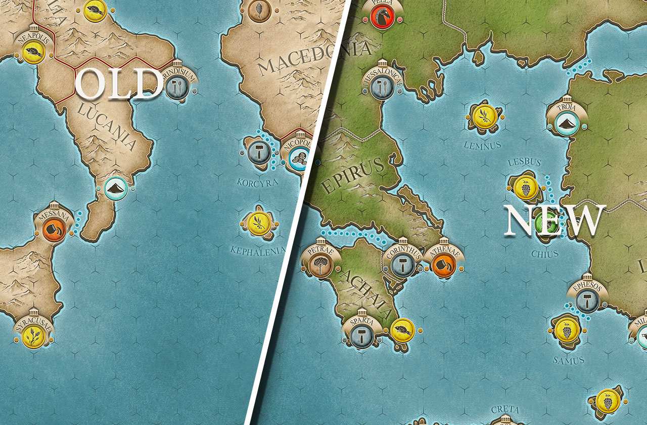
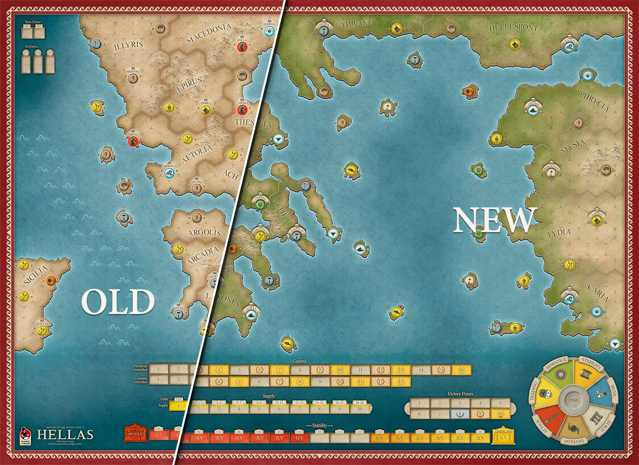
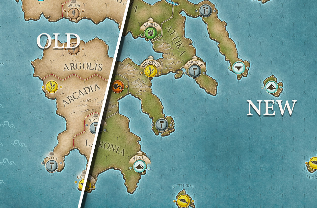
Finally, although I don’t mind the new artwork (the cities and their names appearing above them do look much better now), it does seem to me that the hex borders and region borders are less clear than in the original. Those red regional borders stood out nicely against the tan / khaki. So my advice would be to be very sure that those borders are clear enough on the map as it is very annoying for a board gamer to struggle to clearly see borders; one of the basics of good board game map design. I do understand that you don’t want the borders to stand out too much, especially the hexes, as that detracts from the beauty of the map and hexes with full black borders would be awful, but equally nobody likes to have to squint at the map to try and determine borders. Of course it’s difficult for me to judge without actually seeing the physical map board, so I leave it to you (obviously) to judge whether borders are clear enough.
Best of luck with the Kickstarter project, I’m sure it will be successful this time.
Deon Kritzinger
(Who knows, I might very well be your only South African potential backer! I live in London though, so delivery would not be a problem)
Hi Deon,
thanks for your interest in the series. We will publish the english rules with the Kickstarter launch for download. We have a play trough but it is in Spanish, it does work with Youtube automated translations. At least good enough to give you an impression. Others will come in the future.
With regards to the hex grid. It is very well visible when you actually sit in front of the map. The hexes are rather large, as are the maps. The borders, we will have a look at that 🙂 They are clearly visible to us, but it would not be a problem to change them to red, it would fit into the color palette of the maps also.
Cheers, Marc
Comments are closed.